

Duravit


How Colour Shapes Bathroom Mood & Space

Colour is one of the most quietly influential decisions you’ll make in a bathroom. Long before you notice finishes or fittings, colour sets the mood — shaping how the space feels the moment you step inside.
In a room designed for slowing down, refreshing and daily rituals, the right palette does more than look good. It supports how you want to feel. At Soaque, we see time and again that the most successful bathrooms aren’t the most colourful or the most minimal — they’re the ones where colour has been chosen with intention.
Here’s what actually matters when it comes to colour in the bathroom — and how to use it to create calm, clarity and comfort.
Why Colour Matters in the Bathroom
Bathrooms are some of the most personal spaces in the home. We begin and end our days here, often in moments of quiet or routine. Colour plays a powerful role in how those moments feel.
The right palette can subtly:
- Make a small space feel more open
- Encourage relaxation without feeling flat
- Lift the mood in the morning, soften it in the evening
- Balance natural and artificial light
Rather than thinking in terms of trends, it helps to think about experience. How do you want the room to feel when the door closes behind you?
Whites & Soft Neutrals
Calm, clean and quietly expansive.
Soft whites, creams, taupes and gentle beiges remain some of the most enduring bathroom choices — and in our experience, they work best when they feel warm rather than stark.
These tones create a sense of order and ease, allowing materials and light to do the talking.
What they bring to a space:
- Calm and clarity
- A feeling of openness
- A timeless, spa-like quality
Best suited to: Smaller bathrooms, minimalist schemes, serene retreats.
Soaque perspective: Pure white is giving way to softer neutrals — oat, sand, mushroom and bone tones that feel more natural and lived-in, especially when paired with brushed brass or warm stone.

Blues
Tranquility, freshness and visual stillness.
Blue is often associated with bathrooms for good reason. It echoes water and sky — visual cues that instinctively calm us.
Lighter blues feel airy and refreshing, ideal for creating a sense of space.
Deeper blues and navy add depth and a more cocooning, luxurious feel.
What they evoke:
- Calm and mental clarity
- Clean freshness
- A gentle spa atmosphere
Best suited to: Bathrooms with good natural light, or spaces designed as calming retreats.

Greens
Balance, wellbeing and a connection to nature.
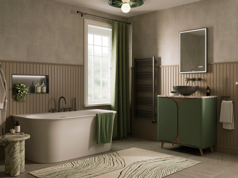
Green has a grounding quality that works beautifully in bathrooms. It sits comfortably between warm and cool, making it one of the most versatile colours we use in design.
What they evoke:
- Balance and restoration
- A sense of wellbeing
- A subtle connection to nature
Best suited to: Earthy, biophilic bathrooms and spaces that incorporate natural materials.
Soaque perspective: Sage, eucalyptus and soft olive tones are increasingly popular — especially on vanity units or feature walls — for their soothing, understated energy.

Greys
Stillness, structure and modern calm.
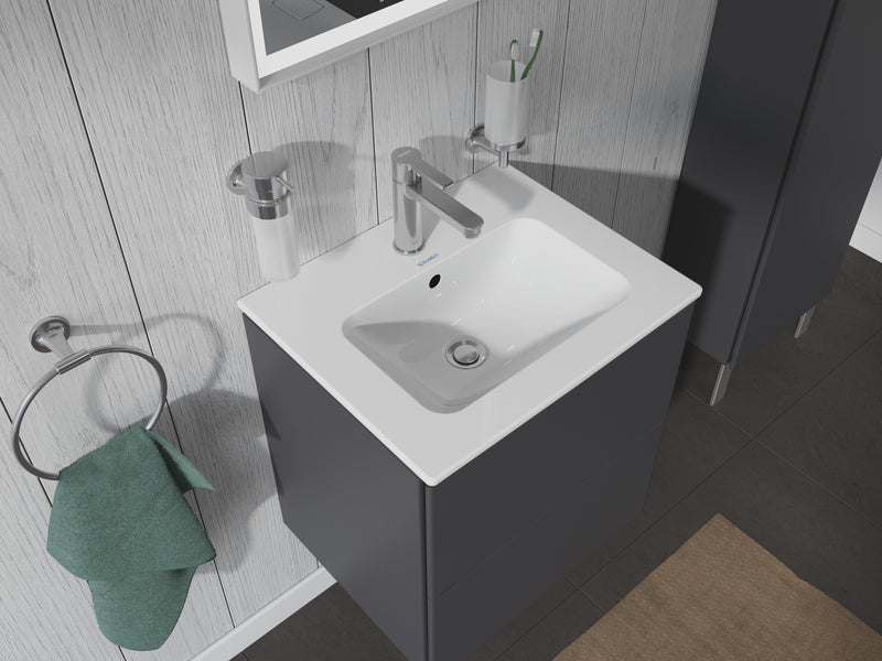
Grey has matured into a quiet classic. The key is choosing the right grey. Cool greys feel crisp and architectural. Warmer greys and greiges introduce softness and calm.
What they bring:
- Visual balance
- A modern, composed feel
- A strong backdrop for texture and material
Best suited to: Contemporary bathrooms, Scandinavian-inspired interiors and homes that favour restraint over contrast.

Blacks & Charcoal
Depth, confidence and cocooning luxury.
Dark tones can feel bold in a bathroom — but when used intentionally, they create some of the most atmospheric spaces we design.
Charcoal and black work best when balanced with texture, light and contrast.
What they evoke:
- Depth and drama
- Quiet confidence
- A sense of retreat
Best suited to: Larger bathrooms, powder rooms or designs that embrace a moody, hotel-like feel.
Design note: In smaller bathrooms, darker tones work best when used consistently, rather than broken up — creating depth rather than visual clutter.

Warm Tones
Soft energy and approachability.
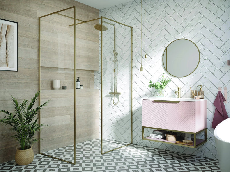
Muted warm tones — think blush, nude, terracotta and soft peach — are increasingly finding their place in bathrooms.
Used with restraint, they add warmth without overwhelming the senses.
What they bring:
- Softness and comfort
- A gentle lift of energy
- A welcoming, human feel
Best suited to: Family bathrooms, modern boho spaces or rooms that feel cool and need warming visually.

Metallic Accents
The emotional finishing touch.
While not colours in themselves, metallic finishes strongly influence how a palette feels.
- Brushed brass adds warmth and softness
- Blackened metals feel modern and grounding
- Chrome keeps things crisp and bright
- Copper introduces artisan character
At Soaque, we often see metallics acting as the emotional bridge — tying colour choices together and subtly shifting the mood of the space.

Choosing Colour for Your Bathroom
Rather than overthinking, we suggest starting with three simple considerations:
1. How do you want the room to feel?
- Calm → neutrals, blues, greens
- Energising → warmer tones, subtle contrast
- Luxurious → dark tones, marble, warm metals
- Spacious → light palettes or cohesive deep hues
2. How much natural light does it receive?
- Lower light → warmer neutrals, mid-tones, soft greens
- Bright light → cooler hues, crisp whites, deeper contrasts
3. How large is the space?
- Smaller rooms benefit from simplicity and tonal consistency
- Larger rooms allow for layering colour and material with confidence
Final Thoughts
Colour is never just decorative — it shapes the way a bathroom feels, functions and supports daily life. The most successful schemes are rarely the boldest or the safest, but the ones chosen with intention.
When colour aligns with how you want the space to feel, the bathroom becomes more than a functional room — it becomes a place of calm, clarity and quiet enjoyment.
Choosing colour becomes much easier when you can see how it interacts with light, materials and layout. Soaque’s 3D design service allows you to visualise your bathroom as a whole — helping you refine colour choices with confidence before making any final decisions.